UI Case Study: Asian Taste – A Bold Culinary Brand Experience for Sushi Enthusiasts in Dubai
Designing a Multilingual, Mobile-First Experience for a Sushi Brand That Fuses Culture with Convenience
Client Overview:
Client: Asian Taste (المذاق الآسيوي)
Sector: F&B / Restaurant / Food Delivery
Location: Dubai
Engagement: Freelance UI/UX Design + Brand Identity Direction
Languages: Arabic-first (RTL) with scalable bilingual layout
Sector: F&B / Restaurant / Food Delivery
Location: Dubai
Engagement: Freelance UI/UX Design + Brand Identity Direction
Languages: Arabic-first (RTL) with scalable bilingual layout
Project Brief:
Asian Taste is a modern Japanese cuisine brand bringing premium sushi and pan-Asian flavors to the Saudi audience. The client sought a full-stack visual and UI/UX revamp that would reflect its food quality, position it as a refined-yet-accessible choice, and drive in-app interactions such as menu browsing, reviews, and bookings.
They wanted to:
Localize the experience for Arabic speakers
Balance minimalism with appetizing visuals
Integrate storytelling with menu discovery
Encourage app installs and reservations directly from the homepage
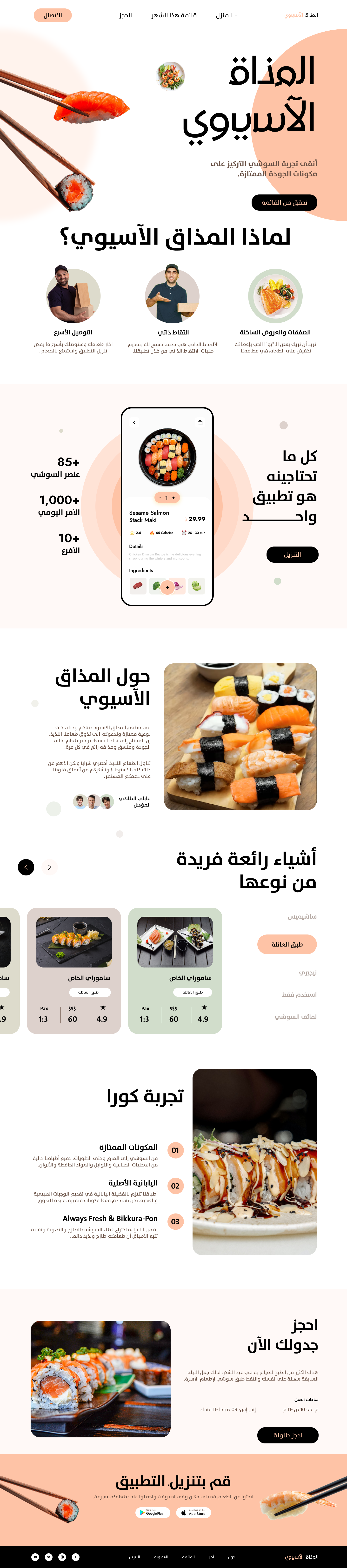
Desktop UI Design
Services Delivered:
1. Visual UI System Design
- Mobile, tablet, and desktop screen designs
- Modular layouts for categories, product cards, reviews
- CTA-focused structure with contextual nudges
2. Art Direction & Content Planning
- Realistic mockup visuals (food, people, interface shots)
- Copywriting for headers, CTAs, and brand story
- Microinteractions and visual cues to increase conversions
3. Typography & Color Palette
- Fonts used: 29LT UA Neo B, The Sans Arabic
-Color base: warm neutrals, soft greens, peach tones, bold darks
-Visual feel: Fresh, elegant, and high-contrast for readability
4. Arabic-First Layout Strategy (RTL Design)
- Fully right-to-left layouts across all screens
-Culturally relevant visual storytelling and menu positioning
-Bilingual-ready typographic system
Platform Screens Designed:
Mobile UI: Vertical stacking, swipeable cards, app install prompts
Tablet UI: Split grid layout, balanced info density
Desktop UI: Spacious, immersive landing page with full menu previews
Promo blocks: Booking modules, reviews, “Why Us” storytelling, app install CTA
Notable Features:
Hero Section:
“Asian Taste — Premium sushi experience focused on quality ingredients”
With: CTA to view the menu
“Asian Taste — Premium sushi experience focused on quality ingredients”
With: CTA to view the menu
Why Asian Taste?
Features: Delivery speed, authentic chefs, hot dishes
With testimonial avatars and quick trust-building layout
Features: Delivery speed, authentic chefs, hot dishes
With testimonial avatars and quick trust-building layout
Integrated Booking System
Reserve a table in seconds with minimalist form design
Reserve a table in seconds with minimalist form design
Sushi Showcases
Highlight bestsellers using images, ratings, portion info, and price
Highlight bestsellers using images, ratings, portion info, and price
Storytelling Cards
Narrative modules like "Kura Experience" and “Always Fresh”
Narrative modules like "Kura Experience" and “Always Fresh”
Bottom CTA
Prominent app download banner with iOS/Android support
Prominent app download banner with iOS/Android support
Outcome:
This design successfully balances appetizing visual storytelling with user-centered layout principles. It’s conversion-optimized for mobile, with scalable design assets that work across different viewports and audience types. The interface simplifies the path to booking and discovery — all within a clean, modern, Arabic-first framework.

Tools Used:
Figma
Photoshop (product image touch-ups)
Arabic typographic layout planning
Color balance and accessibility testing